
Last Kiss of the Evening Sun - Step by Step

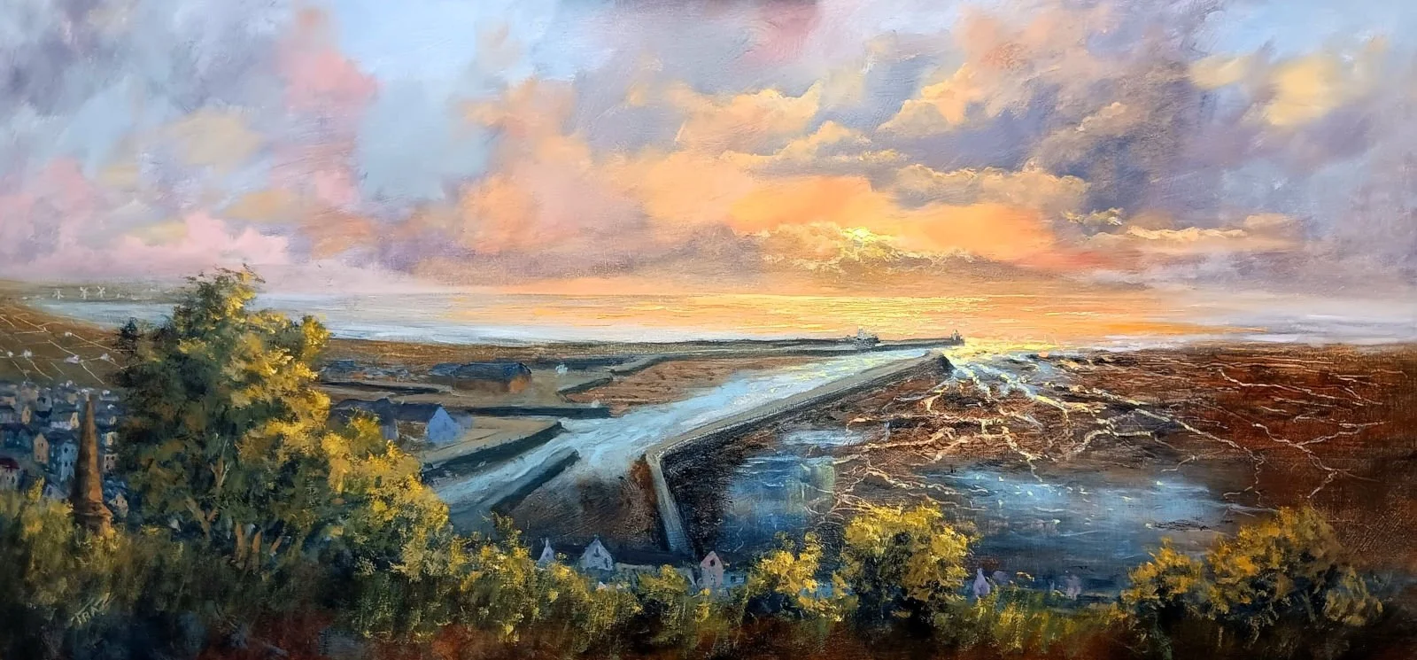
Last kiss of the Evening Sun over Maryport Harbour - by Stuart James Fraser
Last Kiss of the Evening Sun- Oils on Board - My process by Stuart James Fraser.
“This loose impressionistic painting was inspired by a visit to Maryport on the Solway Coast. I was attending the preview event of “Breathe” a solo exhibition in the excellent Shipping Brow Gallery, by superb pastel artist and good friend Sarah Reid. On the way home we experienced an amazing sunset so I stopped above the town for photos.
Another artist friend knew I was painting this panoramic and mentioned how useful it might be to write up how I approach and complete such a painting.
Hence this blog, although it was originally only intended for my friend. I had spent a fair bit of time writing it, and somehow it seemed a shame not to share.
I apologise in advance if I am already preaching to the converted, but for those less experienced I hope the following process might be of some benefit on your artistic journey. Just bear in mind this is my process not neccessarily the best”
TOP TIP: Always have a plan:
Does not need to be complex but a plan is vital . Every artist may have a different approach. However, this is how I usually plan my work.
Make use of Notan studies in your sketchbook to carefully work out the best possible composition for your piece. (Notans are simple squares of ink or pencil where the main features are represented as blocks of solid or hatched areas.) This technique allows you to effectively test different compositions and balance visual elements before fully committing to a final design. It’s a valuable step that can save time and improve the overall impact of your work.
Notan’s used to determine and finalise the panoramic format of the painting
Do thorough research about the colour scheme you plan to use in your artwork. Every artist should have at least a basic understanding of colour theory if you want to achieve success; it is essential to know how to create harmony between your colour mixes, especially when dealing with complex uses of colour that can easily turn to mud or shift unintentionally in the opposite direction. More importantly, you must be able to produce rich, strong darks and luminous lights to enhance both depth and contrast in your painting. This level of control can only be achieved if you have a solid grasp of colour theory. We will explore this topic further later on to deepen your understanding.
Make good use of a colour wheel, which is an extremely useful and practical tool when planning your colour scheme, particularly when using complementary colours to achieve striking and balanced contrasts. Additionally, take the time to create a detailed chart of all your main colour mixes and clearly clarify the specific effects you want to achieve with each one. A very practical tip is to mix colours that you anticipate using frequently in your work and compile them into a reference colour chart. This chart will serve as a handy and reliable guide throughout the entire painting process, helping you maintain consistency, avoid unwanted surprises, and ultimately achieve the desired results.
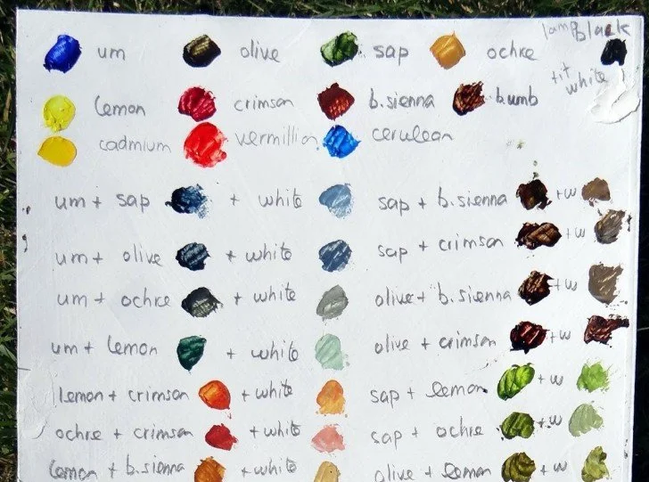
An example of a colour mixing chart:
Create a clear and vivid visual representation of your most frequently used colour mixes. It is truly amazing how often you might find yourself glancing at it throughout your creative process to quickly remember the exact way you blended those colours and the paints used.
What is the purpose of the work? Ask these questions?.
What is the painting about?
What is its hook or focal point?
How do I lead the viewer's eye through my painting to tell my story?
You might know why you painted it, but will the viewer understand?
Bear in mind that your photograph or sketch, however pleasing it may initially seem, will usually be underwhelming when considered as a finished work of art. Most paintings, whether created by beginners or seasoned professionals, often fail due to a lack of a clear plan: issues such as poor composition, inadequate tone or value contrast, weak chroma, insufficient use of darks, lack lustre highlights, absence of guiding pathways or signposts, and a vague or missing reason for why you painted it in the first place.
Take the time to study your favourite artists, as well as those you are less fond of, observing how they handle subjects similar to yours in a variety of ways. Don’t be afraid to experiment with something different—even if you have another artist’s image as a reference in mind, just go for it; over time, the work will naturally evolve to become your own unique expression.
On with the Painting: Stage 1:
Preparing the painting surface:
Firstly, I always apply 2-3 coats of white gesso onto a MDF board measuring 30 by 16 inches to create a smooth and even surface. When my gesso is dry, I normally stain my boards with a mid-tone ground, which is usually a transparent or thin wash of colour (this is called an Imprimatura, the term is Italian for "first paint layer" ). My mid-tone ground is typically a blue grey, raw umber, or raw sienna tone and is applied with a thin mix of paint and medium, then rubbed with a cloth or paper towel until just a coloured stain is left.
For example, JMW Turner often used surprisingly bright areas of interlapping colour as his underpainting, he referred to these layers as his colour beginnings.
However, for this particular type of painting, I make an exception to my usual process and leave my surface white , this allows maximum light to reflect back through my initial transparent or semi-transparent washes of colour, creating the strong atmospheric light that is essential to my work.
Starting the layout:
I very lightly pencil in a level horizon line, bear in mind that coastal paintings must always feature a level horizon to maintain realism and balance. I also very roughly indicated where my main features would sit within the composition. To achieve a harmonious layout, I made full use of the rule of thirds (see Notans above for reference). My primary aim was to create a sweeping panoramic view that conveyed great distance while maintaining minimal detail. The emphasis was on capturing the light as it dramatically hits the sea, harbour entrance and spills into the intricate waterways of the port area.
Using a well-worn brush—its bristles mostly worn away or splayed to avoid producing neat, hard edges and thereby keeping the strokes loose—and applying thin, muted blue and violet washes, I chose to create slightly broken rather than solid lines. This technique helps steer clear of overly sharp edges or excessive detailing. With these careful, subtle touches, I indicated the general areas where the land and clouds would eventually sit, laying the foundation for the atmosphere and mood of the piece.
Important point!
I had to be really careful in my approach, as I was basing my work on two photographs carefully stitched together. Inevitably, photographs tend to contain an overload of intricate detail, and when there is so much happening in your base images, the brain naturally tries to absorb and process all of it. To counter this, I deliberately avoided virtually all fine detail and instead applied successive thin washes of transparent oil paint. This method allowed me to establish what is essentially just three to four broad blocks of colour: the foreground, the mud flats situated to the right of the harbour wall, a deeper shadowed area where the town and parts of the harbour will eventually sit beneath the foreground, and finally leading off into paler tones of olive greys that define the distant horizon stretching to the left.

Stage 1 completed
Normally, I would now apply the sky, as it largely dictates much of the final tone and chroma of the piece, setting the overall mood and atmosphere. However, in this case, I decided to proceed with rubbing out certain areas using a paper towel and cotton buds to create some highlights—specifically focusing on the water in the port area and the tops of the harbour wall where the light naturally hits. Afterward, I strengthened the darks of the harbour entrance and walls by mixing ultramarine, raw umber, and violet, taking care to keep the edges soft and blended, since at this distance, the edges should not appear overly sharp or harsh. Using clay shapers and sharpened old brush handles, I began carefully scratching in the numerous rivulets and water channels located to the right of the harbour, adding fine details that bring the scene to life. I then scumbled some thin pale blue paint to suggest sitting water, lightly dragging the paint down and across with a soft flat brush to subtly enhance the reflected effect. Additionally, I scratched in subtle indications of field systems and marks that might represent houses or other features on the distant left side, adding depth and narrative. Later in the painting process, I will apply glazes over all these areas, which will allow these marks to contribute layers of complexity and become an integral and harmonious part of the overall design.
Important:
Do not try to overpaint this early stage, keep your paints thin with a fast drying medium. Remember you are painting in several stages so applying paint too thickly at this point will mean long waiting times to dry and also be difficult to work over later. I now left the foregrounds to dry. As I make my own short ground gesso and use a fast drying medium, this will be pretty dry for more work the next day or the day after. However, I can now finally move on to the Sky, my favourite part..
“Art Knowledge.
The steps up to this point have created an “ébauche” , a valuable method, taught and used by artists throughout the centuries. Derived from French for “sketch” or “draft,” it is a technique to create a preliminary, thin layer of colour underpainting, usually with desaturated colors, it establishes the basic forms and values before adding finer details and more saturated colours later, establishing the overall structure and the important tone of the painting.”
Stage 2 The Sky.
This is always my favourite part of any painting, firstly because I just love painting skies. More importantly, the sky sets the overall tone and mood for the rest of the entire painting. No further work on the foreground elements can be made until this crucial stage is completely finished. It’s best to keep the application loose at this point by using large brushes to broadly start defining the main areas of colour. To begin, I establish where my orange light source will be located, usually positioned on the right third of the composition. I achieve this by mixing Naples Yellow, White, Cadmium Yellow, and Scarlet Red or Alizarin Crimson (any red pigment works well here).
Then, I loosely and vigorously scrub in patches of paler blues using a combination of Kings Blue, Naples Yellow, White, and a tiny touch of Alizarin Crimson (Alizarin being transparent is a good choice when used sparingly). This slight addition of red helps nudge the blue/yellow colours away from green, steering it towards the softer violet-grey hues of the clouds that will follow. I intentionally avoid covering the entire board, leaving some patches free for the thinner, lighter violet-grey clouds that will be added later on.
Tip: Edge control is important here. This type of sky needs soft blended transitions between each colour shift.
With a string mix, varying combinations of Payne’s Grey, Violet, White, Naples Yellow, plus some orange from the previous mixes to create a nice range of soft violet greys, light to dark. I scrub in the main cloud masses with a big filbert bristle brush, lighter cloud shades on the edges of the painting and obviously heavier and darker around my orange light source, when I apply my final highlights with rich impasto paint it will only ping if there is enough dark tones surrounding . “There can only be bright light when some darkness is present:” Inexperienced painters often fail at this point, they try to add more white to the mix in an attempt to create highlights, it rarely works I am afraid , see the example below
White can be a real killer to colour, especially in yellows and reds as it washes out chroma. For e.g. if you are painting Poppies, and need to have sunlit edges, adding white paint just makes an insipid pastel pink, add yellow to the mix instead to lighten and also create light warm edges.
Black is another colour that can also kill chroma if used on its own, using our Poppy example again, simply adding black as the shadow can create a lifeless cool dark. Try using Alizarin or dark Cad Red to strengthen shadow and increase chroma and warmth.
Ivory Black, is transparent and a very useful tool in your palette. By wisely adding to transparent colours like Alizarin, Ultramarine, Viridian etc you can create some fab nuanced shades to be used in your work. After all, that great man Renoir said "black is the queen of colours" And he knew a bit !!
Stage 3 - Building up some detail.
This is where I start to have some fun, indicating buildings in the harbour area, and by using a series of rectangles and random shapes to indicate buildings in the town. I was not at this point or anytime later in the painting attempting to draw real streets or real houses, just blocks of greys and paler blues that will be glazed over in the final stages. The only concession was the church spire that was a feature of this view , so needed some indication. I began to add some highlights of where my light sources were in the distant clouds and picked out where the sun would be hitting the little creeks and harbour wall etc. Also added the small trees and highlighted foliage that runs along the street edges above the town. This served 2 purposes in my plan.
Firstly, I wanted the viewer to feel he was almost on tiptoes and peering over the foliage into the town and the distant light source. Secondly, it also helped to obscure a good chunk of the town itself, allowing me to simply indicate that some buildings do exist without having to replicate any town structure that local people would rightly check out .
Important… You must not go full on with thick colour paint at this point, leave that until the final stage. I also began working up my sky a little with a series of coloured glazes and scumbled paint and this will continue in the final stage.
I now leave the painting to dry for a few days so I could add my final glazes and impasto paint for my highlights
Stage 3 Completed
Stage 4 - Finishing the painting
Apply Glazes:
Before adding a glaze, I prepare my surface by brushing on a thin layer of my medium over the whole painting and then wiping it back with a soft cloth to leave just a thin film. This is called oiling out and can be done with a variety of oil based or specialist mediums for the purpose. I am happy however, just using my home made medium or even Liquin and I have not seen any issues in the years I have been doing so.
Oiling out helps address any dullness or flat areas in a painting, but also sets up the surface to accept your glaze (the surface must be dry first). Using mixes of transparent Ultramarine Blue and Transparent Burnt Umber/Sienna, applied with a large softish flat brush. I nuanced to the blue side (cool blues recede) for the shaded town, foreground foliage and distant coast to the left of the painting. I actually applied about 3 glazes over this area in total. This area is naturally more in shadow and I needed to darken the shadow so the viewer's eye is immediately steered to the focal point where the light hits the harbour wall and sea.
Important Tip.
This is one of those situations where you must not keep a photograph of the scene in view, as it may never be as dark as you need. You have to resort to the tricks artists have used for centuries to help create darks and light. Remember, as an artist you are the boss.
I also nuanced the next mix to be more sienna/orange over the sandy area to the right of the painting, as it is closer to the viewer and warmer in colour picking up some of the warm light - orange and reds advance..
Adding implied detail:
I began implying more details to the town and harbour area by just using brush marks to indicate buildings and walls, flicks of paler colours to suggest lighter walls areas, boats and masts, harbours cranes, and walkways. This helps to create some confused complexity to give the impression of a busy little harbour town.
Impasto Paint
Finally, it is time to add my highlights. I usually try to marry a more painterly landscape style with a more abstracted contemporary feel, by adding my dabs of highlight using a mixture of palette knife and brush.
Initially, I started adding smaller dabs of highlights with a mix of Titanium White and Lemon Yellow stiffened with cold wax. Finally I used flat brushes to dab in larger blocks of the same mix, designed to be seen from a distance, even though close up it will be a bit messy. My approach is always to constantly check my work by turning the studio lights on and off, when I feel I have created that strong Chiaroscuro effect that is a feature of my work, that is when I stop.
Because I like colour and tone, some of my paintings are often a bit bold, strong in chroma and drama for many artists, however the techniques used here are standard art practice and can be easily utilised by any artist. Anyway I really hope some of this will be useful.
Stuart James Fraser
A short video of the finished painting: